colour

Digital screens and the RGB colour space boast a myriad of colours that traditional CMYK printers cannot reproduce. In Screen as pixel, I learnt that phosphors influence tones depending on the intensity of the light emitted. This experiment investigates the idea of coloured light and how it reacts with printed colours.
Precedent
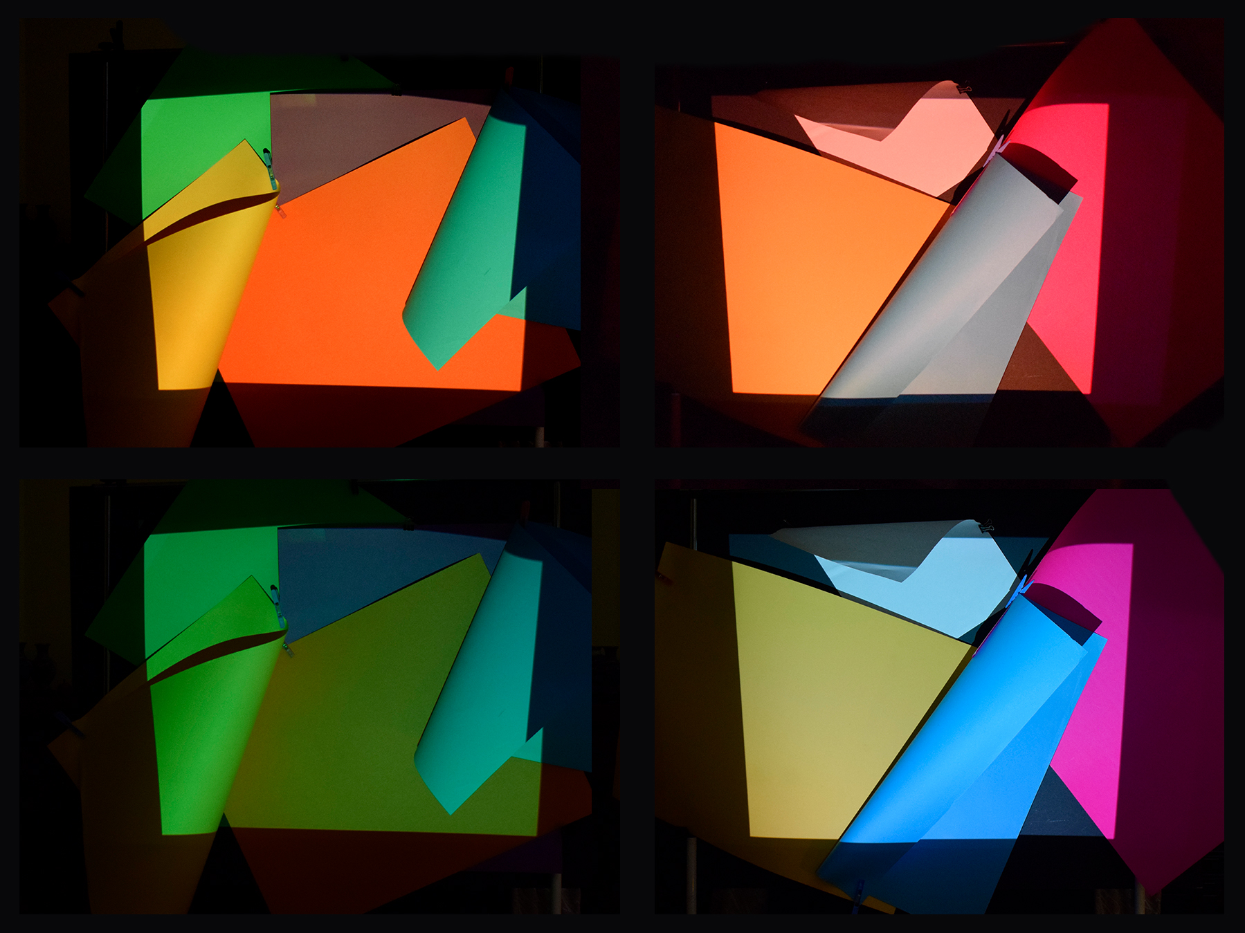
Amsterdam based studio Studio Moniker created the Designer’s Guide to Overprojection to explore the interaction of printed and lighted colour. The installation features three large posters, each printed with a difference shape and difference colour. Projections of set shapes and colours were shone on the posters, creating 60 permutations. Studio Moniker explored ‘projecting light on printed ink’ so what happens with projecting light on projected light on printed ink?
Studio Moniker established a set of colours and shapes to project and print. Similarly, I defined a set of colours to project and coloured cardboard to match.

RGB
Additive colour
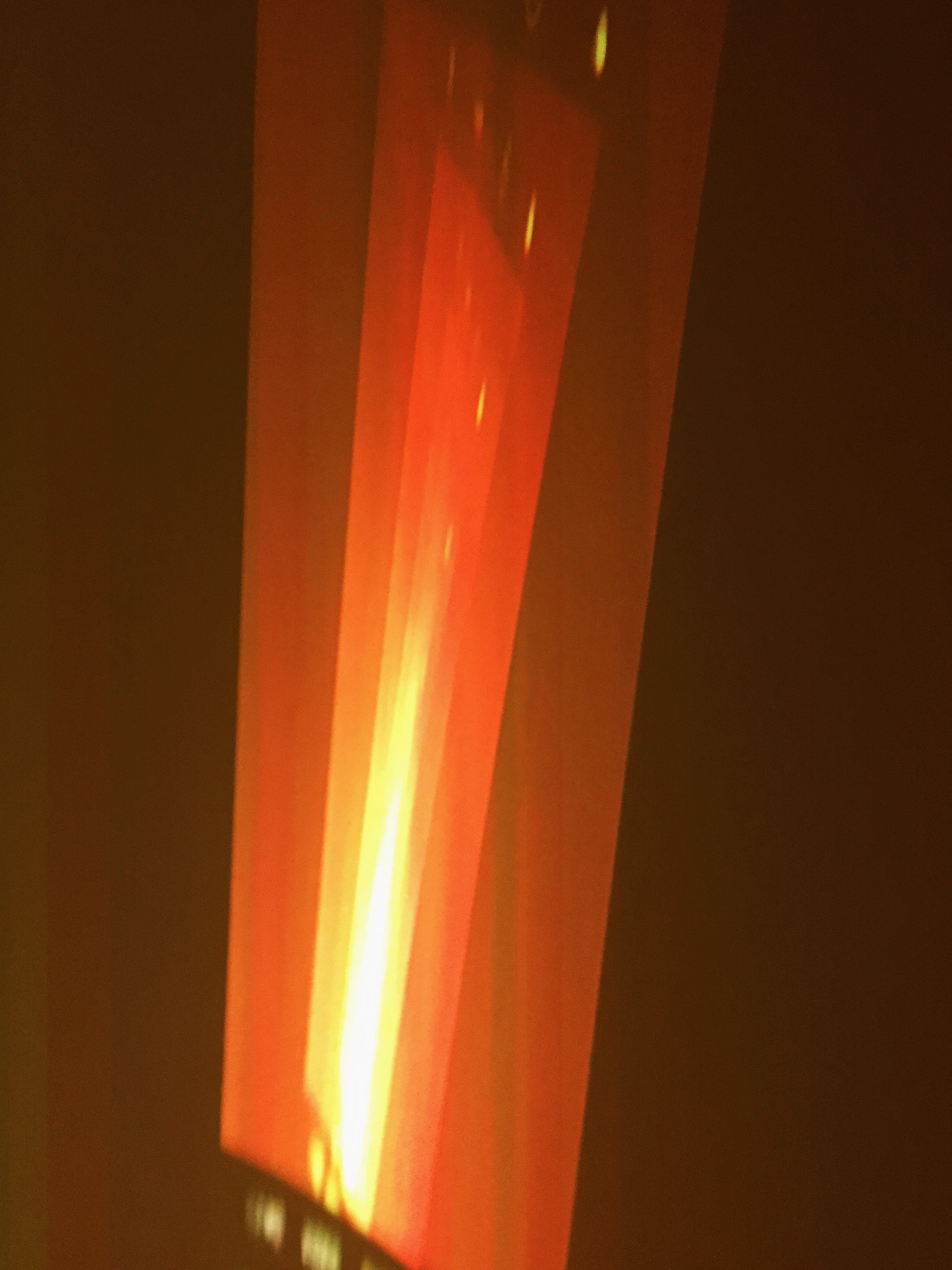
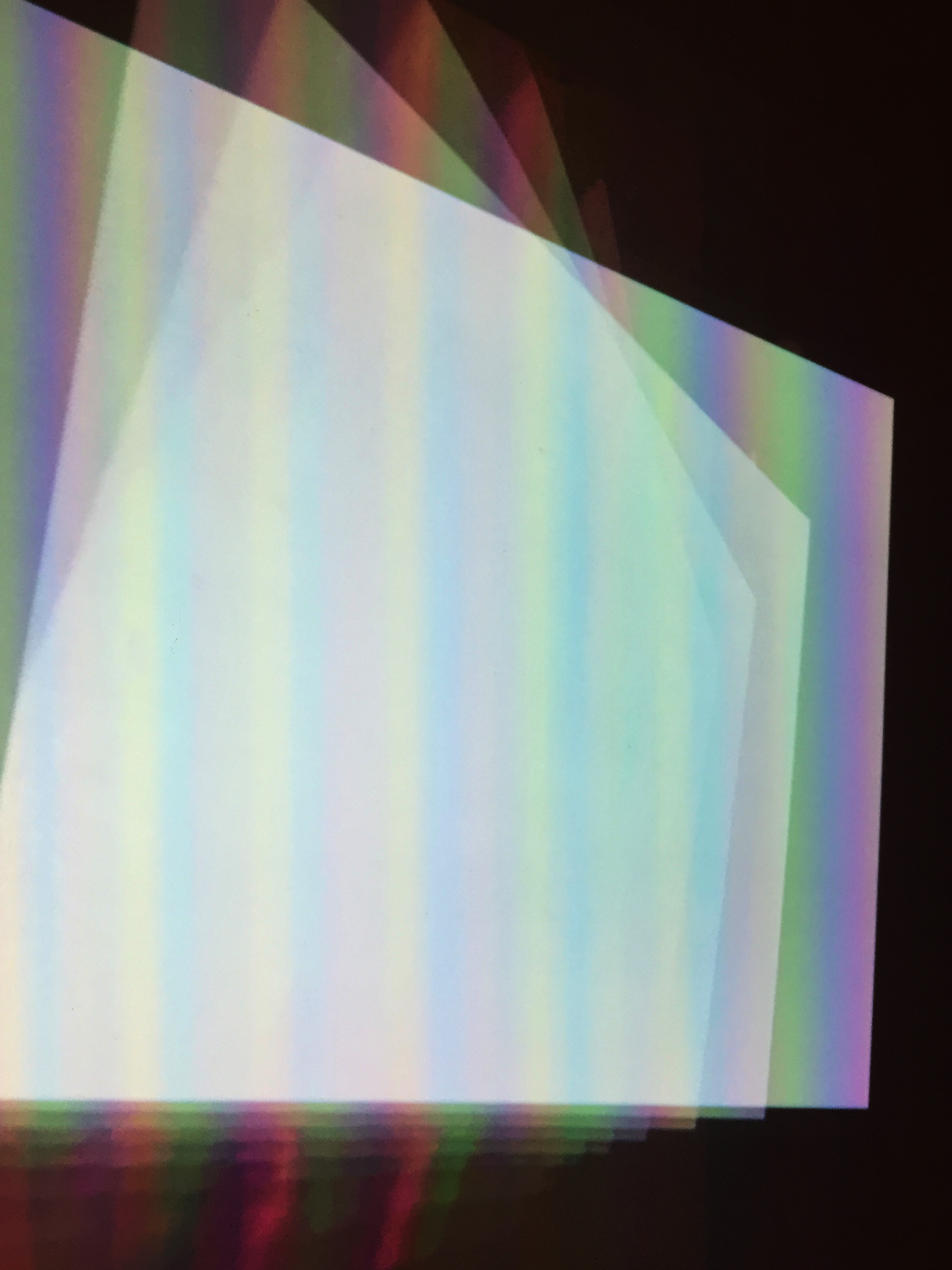
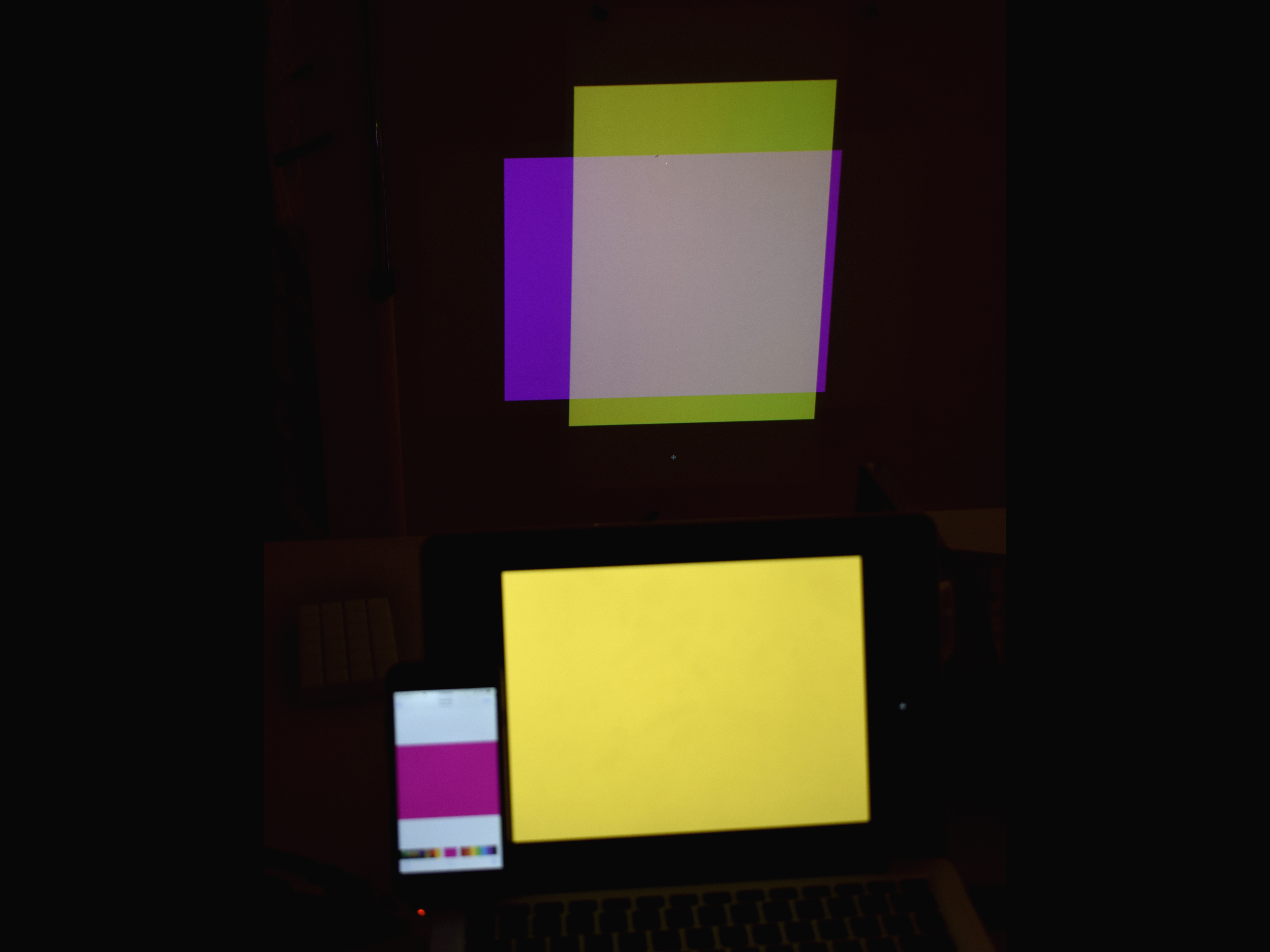
Digital screens use RGB colour space. This is an additive colour space which means you add colours together to create white (CMYK is subtractive as using no colours creates white). In some of my tests, overlapping areas appeared brighter and lighter. Creating another feedback loop. I projected a colour back onto itself. Notice that the light concentrates in the overlapped areas. It looks like a flame.
Results
Projecting light on light
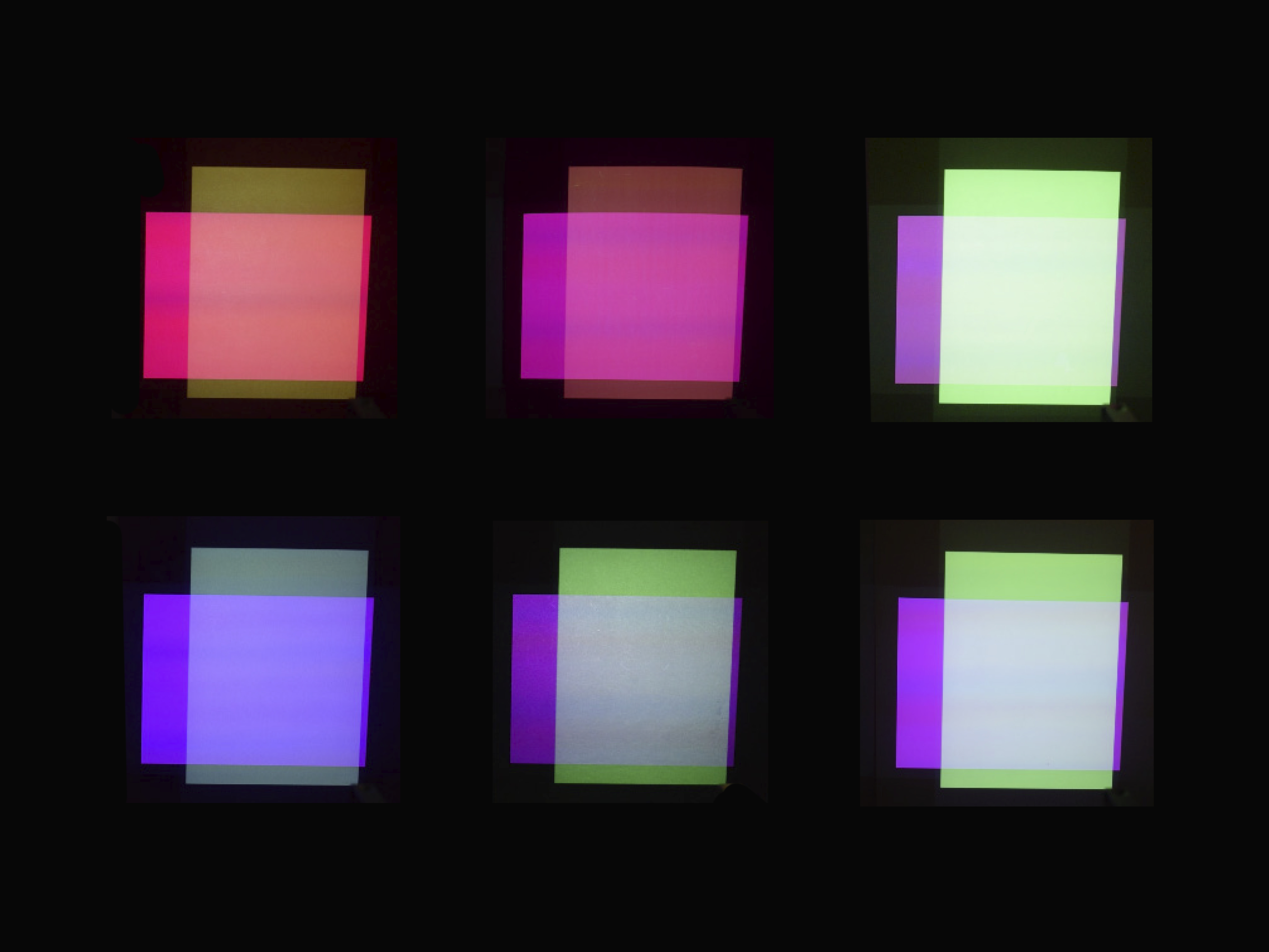
Order of colours: pink, red, orange, yellow, green, blue, purple, black, white.Projecting light on printed ink
Projecting the same colours on coloured cardboard.The colours change significantly when a colour is projected over.
